After way too much debate, I've finally settled on a paint scheme for my DIY Space Marine chapter. I kicked around scheme after scheme, several of which I never posted, trying to find something original and enjoyable. I came to the conclusion that any scheme was going to resemble another chapter somewhere, so I'm going with colors I enjoy painting/like the look of.

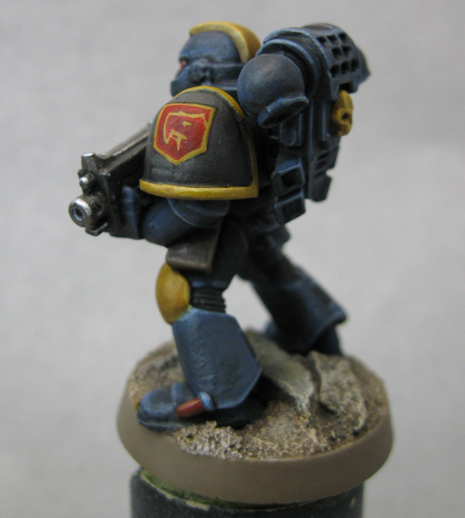
I revised my painting for the Granite Guard, bringing it closer to what I originally envisioned...darker, more muted, less Ultramarines. My current thinking is that the Granite Guard are a successor chapter of the Imperial Fists, and will inherit some of their aptitude for siege and defense. I like the idea of running Vindicators and Ironclads, and the vehicles will further separate the chapter from any blue brothers, as they will predominately be the 'granite gray' of the pauldrons (copy-catting Red Scorpions paint layouts in a lot of ways).


I tackled a lot of 'firsts' with these models, including first attempts at human skin/face/eyes, which was a little daunting, but I was greatly helped by some tutorials. I followed (very slowly) Ron's skin/stubble tutorial and MM(esno)'s eye tutorial.
Another first, the free-hand chapter symbols, which are not too far off my original concept sketch:

Why yes, that eagle head within the shield shape does form a "G" for Granite Guard. I may eventually do a green stuff mold for a raised chapter symbol, but for now I just wanted to see the symbol on the pauldron.


My first goal concerning the Granite Guard is a painted combat patrol force. From there, I'll try to build it by painted squads/units, but I'm not going to abandon my Orks either. I'll may do a SM unit, followed by an Ork unit, we'll see.
7 comments:
Those are some really striking minis. Great stuff. I'm looking forward to more more more.
I like them a lot. I am always surprised by the stuff you turn out.
Great stuff.
They look great! I like the colour scheme and background idea a lot.
I enjoyed seeing these in person, but I totally overlooked the skin tones. Thanks for the close up--nice job! And I like the insignia. Given your fluff, you and I may need to eschew the local trend to focus on tournament-style terrain and build us some mammoth bunkers...
I'm always pretty amazed at how great your stuff is. You've only been doing this for what, a year?
How many models have you actually painted? Unreal.
Great job!
Brent
I really like the skin tone on the Captain. Overall I'm digging this scheme. Nice and Muted but still with good color contrast.
Thanks for wrriting this
Post a Comment